Editing New CRU Themes and Website builds (2023 onwards)
Q. What is a block?
A. A block is a pre designed and pre built front end element, generally representing a full row on the front end of the website. These blocks can be anything such as a full screen hero image (also known as a header image) with overlay title content that you see at the top of most CRU built winery websites. Other examples are a row with a left content section and right image.
Q. I have added the blocks to a new page or an existing page and there is too much spacing, or it doesn't look right?
A. Some blocks will need code to style them properly - called CSS. Our team can handle these issues for you, simply raise a ticket and our team can provide info on what you can do yourself, or assist in fixing any design issues with custom styling code.
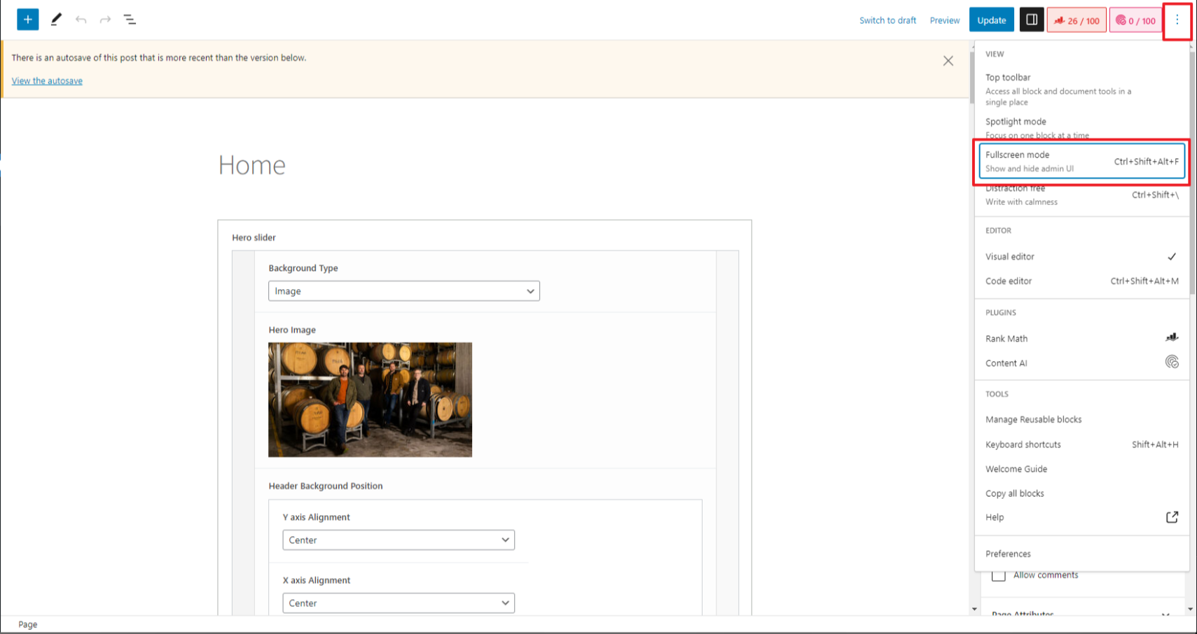
Q. Where can I access WP Toolbar on the new layout pages?
A. You can access by clicking on the kebab menu and click Fullscreen mode, this way you can change the view and access the CRU Support link in the toolbar.
CRU's new website themes and all new website builds no longer utilise page builders. As great as these can be for clients updating their own websites, they use a lot of resources as they are bulky and affect website performance. We solely use the native Wordpress Gutenberg blocks with Advanced Custom Fields (ACF). ACF allows CRU to design and pre build blocks that Gutenberg do not have. As CRU builds more new websites and makes new blocks, these will become available to all clients.
Example of some of the available WP Gutenberg blocks
Editing Pages
To edit your pages, when in the dashboard of your Wordpress website head to the Pages option in your menu, then click the page you want to edit (you can either click on the page title, or the small 'edit' button under the title.
If editing a pre built page, you can determine the type of block you are editing by the title of the block and the way the block looks. If you are not changing the layout or adding new blocks, scroll down and locate the block type you want to edit or click on the Table of Contents on this page.
Page Settings
At the top of the page (when editing) has a toolbar:
- The Wordpress logo takes you back to the Wordpress dashboard
- The Plus sign with blue background brings up all the available blocks to which you can drag into place
- The Pencil toggles between editing a block and being able to select a block
- The forward and back Arrows are undo and redo past actions
- The information icon beings up how details on the page content
- The List icon toggle on a slide out menu that lists each block of the page in order
- Save Draft saves the current status of the page as draft - great for editing a page and finalising before publishing it live
- Preview opens up the front end of the page you are editing in a new tab or displays the page in different formats such as tablet or mobile
- Publish takes the page live, but does not automatically add the page to your websites front end menu
- The Cog icon toggles the right hand settings on or off
- The three dots display view options, toggles between the block editor view or code.
On the right hand side of the page you are editing are some different settings to manage the page:
Status & Visibility
- Visibility:
- Public (everyone can view the page)
- Private (only visible to site admins and editors)
- Password Protected (protects the page with a password)
- Publish - set the date that the page was published
- Author - Who authored the page
- Move to trash - delete the page
Template
These are pre determined page layout features. Generally stick with Full Width, but as each site may differ, best to view an existing page and use the same template if you are creating a new page with similar features.
Permalink
Allows you to click on the page URL to load the front end in a new tab
Discussion
Used more for blogs to allow people to add comments
Page Attributes
Using Parent Pages is a good way to organise your Site Pages into hierarchies. A parent page is a top-level page, with child pages nested under it. This does not set the menu on the front end. To edit the menu displayed on the front end of your website see this guide here
For example, you could have an “About” page as a top level or parent page, and then have child pages “Life Story” and “My Dogs” under it. Under “My Dogs” you could have another page, titled “Rosco”. The URLs might look like this:
Header Type (custom CRU feature)
This setting determines the background of the top of your pages where the menu sits as well as changes the font colour and logo. For example, if you have a header (top section of your site where a menu would be) that is transparent and shows an image behind it that is dark and the menu font is black, you can change the Header Type to Light and it will invert the font colours and the logo so they would show behind a dark image.
Adding new blocks to a page
On a new page, simply click on the + button with the blue background in the top toolbar which will bring up the full list of blocks to edit. Find the block you want to add and drag it into the main part of the page. Or, type / and then type the title of the block you want to add, or click on the + button with the black background
Typing / will bring up a "quick" list of blocks, it will not display all blocks available, but if you know the title of the block you can start typing it and it will populate.
The other way is to click on the + button. This is the same function as typing / except this has a search bar as well as a button to view all of the blocks available.
Once you have added the block you want, simply edit the blocks settings. To understand how to edit each block, scroll down this page and find the block to learn how to edit it.
If you want to add a block under or between existing blocks, hover your curser in between blocks to bring up the below line with the + sign. Click the + and select the block you want to add.
Copy a Block
- Click the three line on the upper left corner to show all block list
- Click the Block you want to copy and click the three dots
- Click on "Copy"
- Go to the page you want it to paste
- Scroll down to bottom, put cursor on "Type / to choose a block"
- Paste
Moving blocks on a page
Once you have added a block, you can move it up or down the page to rearrange the position of any block. Simply hover over the block you want to move, that will bring up a small toolbar. Move your curser over the 6 dots click and hold to move up or down. The other way is to click on the up or down arrow on the toolbar located next to the 6 dots. This will shift the block up or down 1 block.
Block Toolbar and Settings
Clicking on a block brings up a toolbar (as per instructions above). At the right hand side of the toolbar are 3 dots, click to bring up a settings menu as per the below screenshot.
Editing CRU Blocks
The below blocks are CRU built ACF blocks which show you how
CRU Page Hero

Purpose
This is used to put page Hero either just single image or slider
How to Use
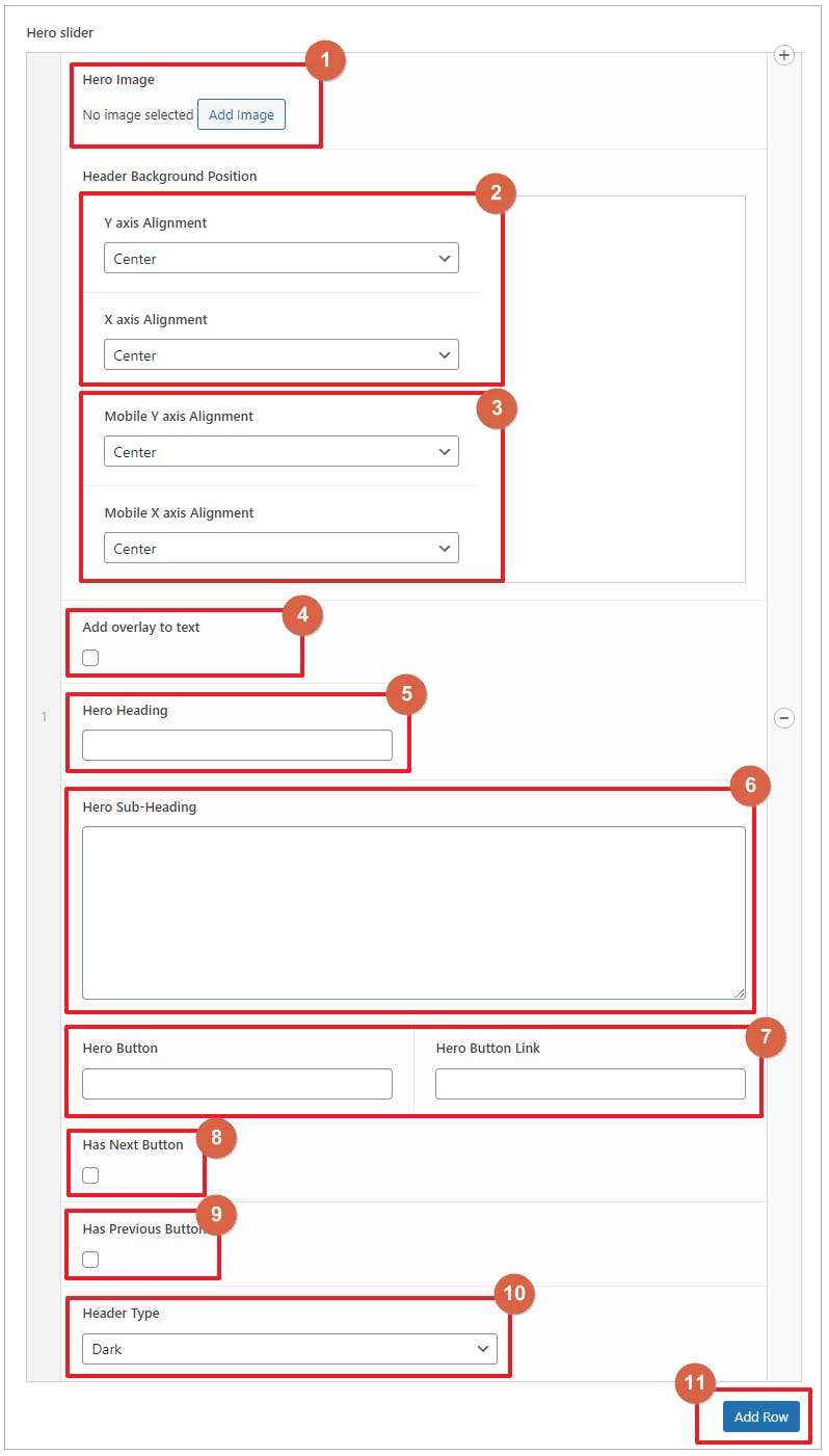
- Upload or select on the media library the image you want as background
- You can set the image position on desktop. You can select Either Center, Top, Bottom, Left or Right. You can also select custom but you will be asked to provide the % value. If it Y-axis, the value will base from the top. If it is X-axis, the base will start from left.
- Same as step 2, you can set the background position on mobile here.
- If this checkbox is checked, a background color will be added behind the Heading and Sub-heading texts. You will be also asked to select background color and its opacity
- Enter the Heading text here
- Enter the Sub-heading text here
- If you want to put a button under the subheading, you can add the Button label and link here.
- If you want to have a custom next slide button, you can check this checkbox and you will be asked to input the custom next button text
- Same as step 8, you can also add a custom previous slide button here
- Select what would be the header type when this slide is active. If the background is dark, we recommend to use Light on header type. And if the background is light, we recommend to use Dark
- You can add as many slide as you want, you just need to do steps 1-10 each slide
CRU CTA Grid

Purpose
This is used to put an element grid with contents on each grid cell
How to Use
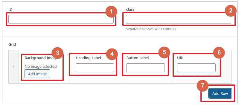
- You can add ID of the element here. This is useful if you want to anchor to this element via link. This is options
- You can add Class for the element here. Classes are useful for styling and script for developers. This is also optional
- You can upload or select from the media library for the background image of the grid item
- Add a heading text here
- Enter the Button label here
- Add the link for the button here
- you can add other grid items by clicking ‘Add Row’ button. You need to do steps 3-6 on each item
CRU Latest Posts

Purpose
This is used to show the latest posts
How to Use

- You can add ID of the element here. This is useful if you want to anchor to this element via link. This is optional
- You can add Class for the element here. Classes are useful for styling and script for developers. This is also optional
- Add margin on the element, you can add top, right, bottom and left by using this format 20px 30px 50px 10px. Meaning 20px top, 30px right, 50px bottom and 10px left.
- Add padding on the element, you can add top, right, bottom and left by using this format 20px 30px 50px 10px. Meaning 20px top, 30px right, 50px bottom and 10px left.
- Select the category you want to show. It is needed to select one as it will cause error if no category selected
- Input the number of posts you want to show. If left blank, it will show all of the posts under the selected category
CRU Featured Products

Purpose
This is used to Shows Featured Products
How to Use

- Input how many featured products you want to show. It should not be blank or it will cause issues on the front-end.
CRU Short Code

Purpose
This allows user to put short code and the block will render the short code on the front-end
How to Use

- Enter you shortcode here. it is important to add the whole shortcode includ the brackets, example [woocommerce_cart]
- if this is ticked, the element will have a full width but with respect to the parent element if there is any.
- You can add ID of the element here. This is useful if you want to anchor to this element via link. This is optional
- Add margin on the element, you can add top, right, bottom and left by using this format 20px 30px 50px 10px. Meaning 20px top, 30px right, 50px bottom and 10px left. (Optional)
- Add padding on the element, you can add top, right, bottom and left by using this format 20px 30px 50px 10px. Meaning 20px top, 30px right, 50px bottom and 10px left. (Optional)
CRU Image Gallery Grid

Purpose
This shows a grid of selected images
How to Use

- Upload or select images you want to show on the grid
- Select how many columns the Grid will have
- You can add ID of the element here. This is useful if you want to anchor to this element via link. This is optional
- Add margin on the element, you can add top, right, bottom and left by using this format 20px 30px 50px 10px. Meaning 20px top, 30px right, 50px bottom and 10px left. (Optional)
- Add padding on the element, you can add top, right, bottom and left by using this format 20px 30px 50px 10px. Meaning 20px top, 30px right, 50px bottom and 10px left. (Optional)
CRU Image Gallery Slider

Purpose
This is a block to show a slider of images
How to Use
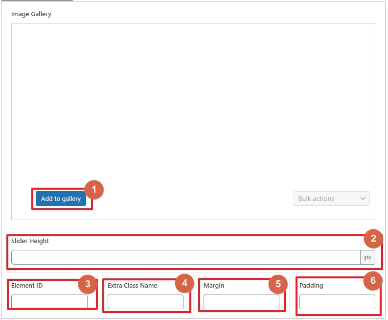
- Upload or select images you want to show on the slider
- Set the height of the slider
- You can add ID of the element here. This is useful if you want to anchor to this element via link. This is optional
- You can add Class for the element here. Classes are useful for styling and script for developers. (Optional)
- Add margin on the element, you can add top, right, bottom and left by using this format 20px 30px 50px 10px. Meaning 20px top, 30px right, 50px bottom and 10px left. (Optional)
- Add padding on the element, you can add top, right, bottom and left by using this format 20px 30px 50px 10px. Meaning 20px top, 30px right, 50px bottom and 10px left. (Optional)
CRU Google Map
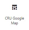
Purpose
This is a block to show a google map iframe
How to Use
- Set the height of the map
- Paste the embed HTML code. (see the instruction added)
- You can add ID of the element here. This is useful if you want to anchor to this element via link. This is optional
- Add margin on the element, you can add top, right, bottom and left by using this format 20px 30px 50px 10px. Meaning 20px top, 30px right, 50px bottom and 10px left. (Optional)
- Add padding on the element, you can add top, right, bottom and left by using this format 20px 30px 50px 10px. Meaning 20px top, 30px right, 50px bottom and 10px left. (Optional)
CRU Free Text

Purpose
This is a WYSIWYG block that allows user to put a content with html elements
How to Use

- Enter you contents here. You can also add html code by switching to Text mode.
- Select the width of the element. If you select Full Width, the element will have a full width but with respect to the parent element if there is any.
- You can add ID of the element here. This is useful if you want to anchor to this element via link. This is optional
- You can add Class for the element here. Classes are useful for styling and script for developers. (Optional)
- Add margin on the element, you can add top, right, bottom and left by using this format 20px 30px 50px 10px. Meaning 20px top, 30px right, 50px bottom and 10px left. (Optional)
- Add padding on the element, you can add top, right, bottom and left by using this format 20px 30px 50px 10px. Meaning 20px top, 30px right, 50px bottom and 10px left. (Optional)
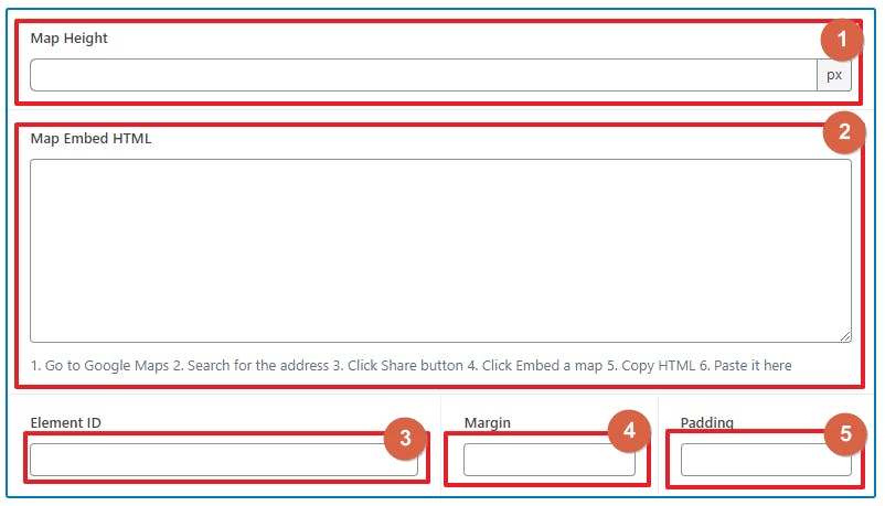
CRU Empty Space

Purpose
This is a block used to give big spaces between rows or elements
How to Use
- Set the height of the space.
- Set the background color. Remain empty if you want it to have no background
- You can add ID of the element here. This is useful if you want to anchor to this element via link. This is optional
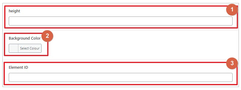
CRU Two Column Slider

Purpose
This is a block used to have a slider of 2 column row with one column having text contents and the other column contains an image
How to Use
Settings Tab
- On the Settings tab, select your preferred Row Style
- Select on which side the Media column will be
- Select the Height of the column slider. Default will adjust the height depending on the contents. If you select Fixed, you will choose between 650px, 950px and 1250px.
Content Tab
- On the Content tab, select the background type you like, selecting Custom, you will need to choose the background color you like
- You can add ID of the element here. This is useful if you want to anchor to this element via link. This is optional
- Select the Content Type you want, If you select Custom, you can add different kind of contents and proceed to step 4. If you select Image, you need to upload or select image you want to show, you might also need to select image for mobile but it is optional. If you select Video, you need to provide the html code to show the video. You will also be asked to background image and mobile image, this will be used to show before the video plays.
- If you select Custom on step 3, you can add 4 types of contents. Title, Description, Custom Content, Links and Shortcode. You can stack these content types.
- Same to step 4, you need to select what content types you need for the non-media side of the 2 column element.
- Click this button if you want to add another slider for the slider. You will then need to repeat steps 1 - 5.
Dev Tab
- Select the row type. If you select Full Width, the element will have a full width but with respect to the parent element if there is any.
- You can add ID of the element here. This is useful if you want to anchor to this element via link. This is optional
- You can add Class for the element here. Classes are useful for styling and script for developers. (Optional)
CRU Product Slide

Purpose
This is a block that will show a list of wines that can be scrolled horizontally
How to Use
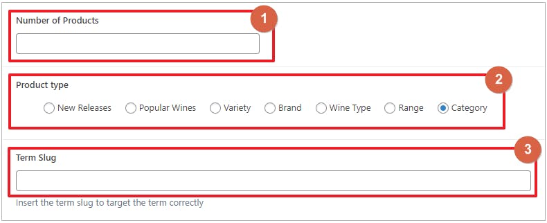
- Set the number of products you want to show
- Select the taxonomy you want. Note that not all of these terms might be available on your site. See available terms same as the image below the one with red boxes.
- Enter the slug of the term you want to show. It is important that the term you added is under the taxonomy you selected in step 2. See image below as reference, the ones inside the green box
CRU Product Reviews

Purpose
This shows a slide of reviews
How to Use
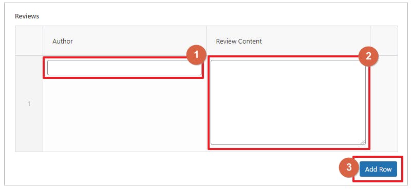
- Enter the Author’s name of the review
- Enter the review content
- Click this button if you want to add another review
CRU Single Post Heading
Purpose
This is a block used to put Hero element on post pages. This works differently with Page Hero
How to Use
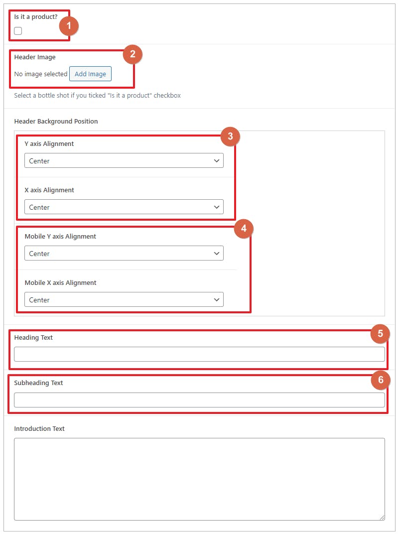
- Check this if the post is about product. (this is very optional and can be neglected).
- Select the background image you want for the header
- You can set the image position on desktop. You can select Either Center, Top, Bottom, Left or Right. You can also select custom but you will be asked to provide the % value. If it Y-axis, the value will base from the top. If it is X-axis, the base will start from left.
- Same as step 2, you can set the background position on mobile here.
- Input the Heading Text here
- Input sub-heading Text here
- Add the short intro text here
Wordpress Gutenberg Blocks
Paragraph
The following settings are available when using the paragraph block:
- Alignment: Left, Center, Right
- Bold
- Italic
- Strikethrough
- Links
- Drop Cap
- Font Size
- Font Color
- Background Color
- Additional CSS Class
If you need something other than what’s listed above, you will need to use a different type of block. The paragraph block only provides these basic options.
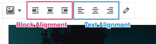
Text Alignment
You can align your paragraph to the left, right or center of the page. In most cases, you will not want to modify this setting, and use your theme’s default text alignment.
If you’re trying to draw attention to your text, you might want to use the center alignment. But keep in mind, center aligned text is much more difficult to read than left aligned text.
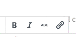
Bold, Italics & Strikethrough
These options were also available in the classic WordPress editor, and they can be used the same way in Gutenberg.
Simply click the B for bold, the I for italics, and the ABC for strikethrough.
Links
Not much has changed in the WordPress editor when you want to insert a link.
- Highlight the text you want to link
- Click the link icon
- Type or paste in your URL
- Click Enter
Now let’s take a look at the advanced settings for paragraph blocks.
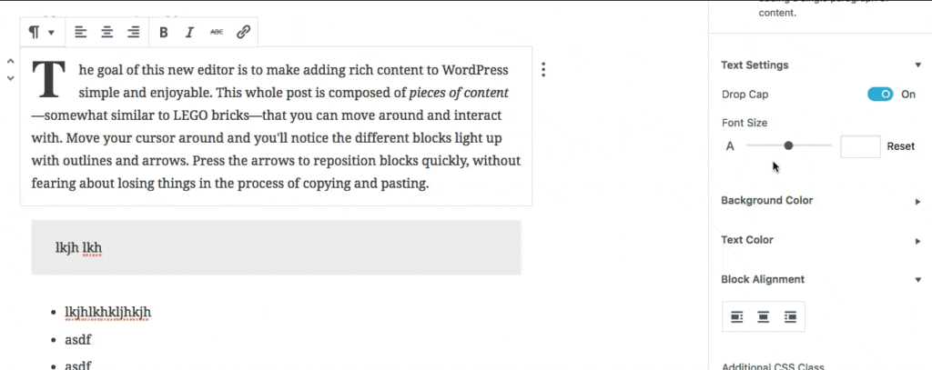
Advanced Paragraph Settings Panel
Here’s a look at all the advanced settings available for paragraph blocks.
Text Settings
Drop Cap

Enabling the Drop Cap feature of a paragraph block will emphasize the first letter of the first word.
- It’s font size will be larger than the rest of the paragraph
- It will be displayed with a heavier font weight (aka: bold)
- The surrounding text will wrap around & underneath it, creating a floating effect
Font Size
You can easily adjust the font size of each paragraph. There are two ways to change the font size of a paragraph:
- Use a slider
- Enter a font size (in pixels)
You can also remove any custom font size using a Reset link. This will force the paragraph to inherit the default font size of your theme.
Background Color
Text Color is another way to make a paragraph block stand out. Just like background color, choose a predetermined color, or pick a new color using the color wheel.
Click the Clear link to reset the text color to your theme’s default.
Block Alignment
Block alignment is not the same as text alignment.
Block alignment will actually move your entire paragraph in relation to the content surrounding it.
For example, a left block alignment will move your paragraph to the left, and whatever blocks you have below that, they will float up to the right side of your paragraph block.
The new WordPress editor gives you three block alignment options:
- Left
- Center
- Right
Left & Right will float your block to its respective side. Center will align your paragraph block in the center of the page, possibly adding some space to the left & right of it.
List

The following settings are available when using the list block:
- List Type: Bulleted or Numbered
- Indent & Outdent list items
- Bold
- Italic
- Strikethrough
- Links
- Additional CSS Class
If you need something other than what’s listed above, you will need to use a different type of block. The list block only provides these basic options.
Bulleted or Numbered List
The first two buttons in the list editing toolbar are for switching between a bulleted list and a numbered list.
Use a bulleted list when the order of your list items does NOT matter. If your third list item could easily be moved to #1, and it would not impact the meaning of the list, then a bulleted list is what you want.
Use a numbered list when the order DOES matter. Step-by-step instructions are a good example of when the order matters.
Indent & Outdent
These two options are for creating more complex lists. In a way, it allows you to create lists within lists.
If you have list items that should be sub-items of a parent item, you can use the indent button.
Here’s an example:
In the classic WordPress editor, you used to be able to use the TAB key to achieve this. However, in the new WordPress editor, using the TAB key will move your cursor to the next block.
Bold, Italics & Strikethrough
These options were also available in the classic WordPress editor, and they can be used the same way in Gutenberg.
Simply click the B for bold, the I for italics, and the ABC for strikethrough.
Links
You can link an entire list item, or just part of it. This works the same way as it always has:
- Highlight the text you want to link
- Click the link icon
- Type or paste in your URL
- Click Enter
Switch a List to a Different Block
You can only switch a list block to two other block types:
- Paragraph
- Quote
Each one works a bit differently:
Switch a List to a Paragraph Block
When you convert a list to a paragraph, each list item becomes its own paragraph block. So essentially, you go from having 1 list block to having 3 paragraph blocks.
Switch a List to a Quote Block
When switching to a quote block, each list item becomes its own paragraph within your quote, except for the last item.
The last list item will become your <cite> element. This is used to identify the author of the quote.
Heading

The following settings are available when using the heading block:
- Heading Level: H1, H2, H3, H4, H5 or H6
- Text Alignment: Left, Center, Right
- Bold
- Italic
- Strikethrough
- Links
- HTML Anchor
- Additional CSS Class
Bold, Italics & Strikethrough
These options were also available in the classic WordPress editor, and they can be used the same way in the new WordPress editor.
Simply click the B for bold, the I for italics, and the ABC for strikethrough.
Links
You can choose to link your entire heading, or only part of it.
- Highlight the text you want to link
- Click the link icon
- Type or paste in your URL
- Hit Enter
Heading Type - H2, H3, H4
You’ll see a few buttons that allow you to change the type of heading. In the quick editor toolbar directly above your heading, you’ll see options for H2, H3 and H4.
However, over in the right sidebar under the advanced settings, you can use any heading tag (H1 through H6).
NOTE: It is not recommended to use an H1 tag inside of your content. Typically, the H1 tag is reserved for your page title, which is already being displayed on your page dynamically by your theme.
Advanced Heading Settings
There are a few additional options in the advanced settings area.

Text Alignment
You can align your heading to the left, right or center of the page.
HTML Anchor
HTML anchors allow you to link directly to this section on the page.
In more technical terms, using the HTML anchor field will add the id property to your heading element.
Here’s an example if you entered “section-name” into the HTML anchor field:
<h2 id="section-name">Section Title</h2>Then you would add a normal link somewhere else on the page, and in the link field, you would enter:
#section-name
That would jump you to the exact point on the page where that heading tag is located.
Recommendation: Do NOT use spaces in the HTML anchor field. Stick to single words, or separate multiple words with a hyphen (-). Do not use any other special characters.
Subhead
The following settings are available when using the subhead block:
- Bold
- Italic
- Strikethrough
- Links
- Additional CSS Class
Bold, Italics & Strikethrough
These options were also available in the classic WordPress editor, and they can be used the same way on the subhead block in the new WordPress editor.
Simply click the B for bold, the I for italics, and the ABC for strikethrough.
Links
You can choose to link your entire subhead, or only part of it.
- Highlight the text you want to link
- Click the link icon
- Type or paste in your URL
- Hit Enter
Simply click the B for bold, the I for italics, and the ABC for strikethrough.
Links
Not much has changed in the WordPress editor when you want to insert a link.
- Highlight the text you want to link
- Click the link icon
- Type or paste in your URL
- Click Enter
Now let’s take a look at the advanced settings for paragraph blocks.
Advanced Subhead Settings
The only additional setting for subheads in the advanced settings area is an additional CSS class.
As a reminder…
Additional CSS Class
Like most block types, you can add a custom CSS class to any subhead block. You can utilize this field to write styles of your own.
- Multiple CSS classes are permitted
- Separate each class name with a space
Switch a Subhead to a Paragraph Block
You can only convert a subhead into one other type of block:
- Paragraph
Converting a subhead into a paragraph will simply remove the extra styling and return your text to the default style for all paragraphs.
Table

The table block should be used for displaying numbers, comparisons or any other type of tabular data in table format.

Currently, the table block is very limited in terms of what it can do. There are no styling options, nor can you define table headers, footers or summaries.
But if all you need is a simple table with a few rows and columns, the table block is for you.
Button

The following settings are available when using Gutenberg buttons:
- Alignment: Left, Center, Right
- Bold
- Italic
- Strikethrough
- Link
- Font Color
- Background Color
- Additional CSS Class
Button Text & URL
Your button’s text & URL can be customized right within the editor. Just type your text within the button, and include your URL next to the chain link icon directly below the button.
Bold, italic & strikethrough styles are also available for selected text within the button.
Button Alignment
You also have the option to float the button to the left or right (wrapping text around it), or center it on the screen. Just click the appropriate alignment option found directly above the button.

Button Colors
The button colors are updated in the advanced settings panel (found in the right sidebar). You have two options:
- Background color
- Text color
Choose from a preexisting color that has been chosen by your theme, or click the multi-colored circle to choose a custom color.
Reminder: In order to stay on brand and show a consistent design, I recommend sticking to the same one or two styles for all of your buttons.

Columns
The only real setting is the number of columns. You can select anywhere from 2-6 columns.
Like all blocks, an additional CSS class is also supported.
Preformatted Block Styling
Your preformatted block will be styled by your theme, and will typically be displayed in a monospace font.
Spacing & Responsiveness
When testing the text columns block, I noticed two important things:
- Automatic spacing is applied between columns
- The columns do not stack on smaller devices, meaning they get very squished
It is likely that WordPress is working on a way to better handle the responsiveness of text columns. It’s also possible that it’ll be left up to theme developers to decide how to handle them.
Image
How to Add an Image in Gutenberg
When adding an image in Gutenberg, you can upload a new image or choose an existing one from your Media Library. There are now 3 ways to add an image:
1. Drag'n'drop an image from your computer onto the editing screen
2. Click the "Upload" button to select an image from your computer
3. Choose an existing image from your Media Library
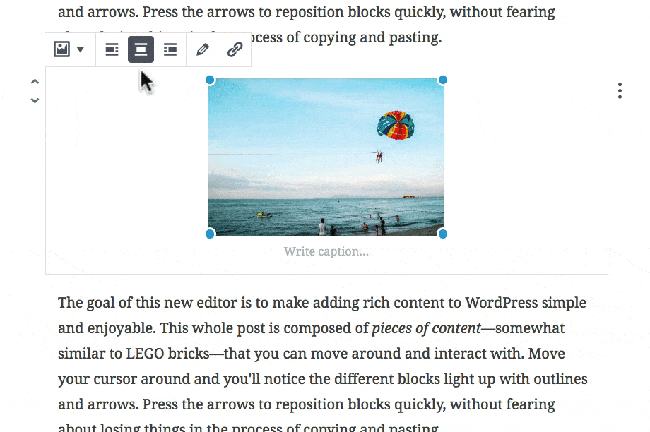
How to Resize an Image
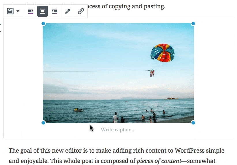
One of the new features of the Gutenberg image block is the ability to resize your image. You can’t crop it, but you can include a smaller version while maintaining the image dimensions.
- Grab any one of the blue circles in the corner of the image
- Click and hold
- Drag either inward or outward, depending on whether you want to decrease or increase the image’s size.
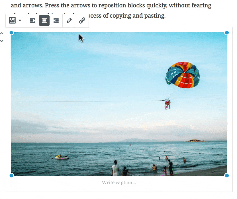
Image Block Alignment
Changing the alignment will actually move your image in relation to the content surrounding it.
For example, a left block alignment will move your image to the left, and whatever blocks you have below that, they will float up to the right side of your image.
You have three block alignment options to choose from:
- Left
- Center
- Right
Left & Right will float your image to its respective side. Center will align your image block in the center of the page, possibly adding some space to the left & right of it.
NOTE: You may need to reduce the size of your image for the left & right alignment options to work properly.
Image Captions
mage captions will be styled by your theme, but you can set a few additional options on your own:
- Bold
- Italics
- Strikethrough
- Links
Click the B for bold, the I for italics, and the ABC for strikethrough.
Here’s a quick example:
Link an Image
If you want your image to link to another destination, you can simply use the link icon in the toolbar.
Advanced Image Settings Panel
Most of the image settings are located right above the image block. There are a few additional things you can do in the advanced settings panel.
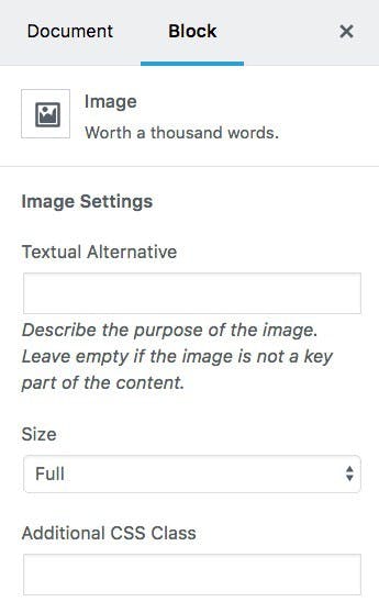
Textual Alternative
This is more commonly known as “Alt Text.” If your image is a main part of the content, you should provide a textual description of it. If your image is purely for design purposes, you can leave this blank.
Image Size
You can adjust the size by moving the blue circles on the 4 corners, as described above. However, you can also select from one of your pre-determined WordPress image sizes here.
Additional CSS Class
If you’re looking for even more control over your image, you can add an additional CSS class and write custom styles of your own.
- Multiple CSS classes are permitted
- Separate each class name with a space
You can also still edit an image in the same way as you did in the classic editor. Just click the pencil icon to open the image in the WordPress Media Library, where you can:
- add/edit alt text
- add/edit a title
- add/edit a caption
- edit the image (crop, scale, rotate, etc.)
- choose a different image
Convert an Image to a Gallery
The image block can only be converted to one other block type, and that’s a gallery. Choosing this option will allow you to choose more images—in addition to your current one—to add to a gallery.
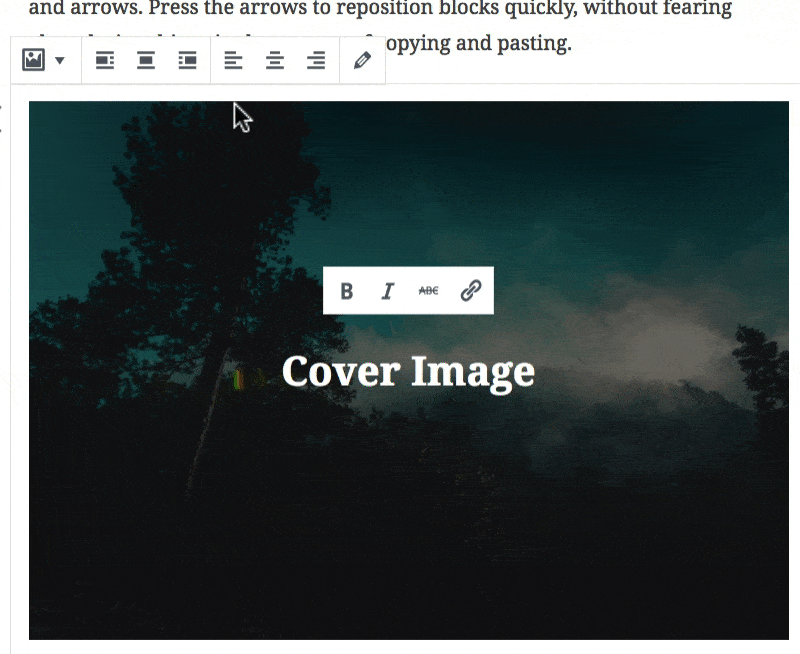
Cover Image

Cover Image Block Alignment
There are two types of alignment you can use with the cover image: block alignment & text alignment.
Changing the block alignment will actually move your cover image in relation to the content surrounding it.
For example, a right block alignment will move your cover image to the right, and whatever blocks you have below that, they will float up to the left side of your cover image.
Advanced paragraph settings are broken up into sections, and located in the Block Settings panel (also called “Advanced Settings”) on the right side of the editing screen.
Cover Image Text Alignment
Text alignment just aligns the text within the cover image block, and the block itself will continue to take up the full width of your content area.
Fixed Background
Another cool option with the cover image is the ability to set the image as fixed. This means the image is locked in the background and does not move as the user scrolls down the page. But all other elements on the page scroll normally.
Here’s an example:
Background Dimness
You can also set the background dimness in increments of 10, from 0-100. The dimness refers to the opacity level of the black overlay that is placed over the image.
Here’s an example:
NOTE: You can type in values that are not increments of 10, but WordPress just rounds them to the nearest 10.
Cover Image Text Options
The text within your cover image will initially be styled by your theme, but you can set a few additional options on your own, as well as link the text within your cover image.
- Bold
- Italics
- Strikethrough
- Links
Click the B for bold, the I for italics, and the ABC for strikethrough.
Additional CSS Class
Just like all Gutenberg blocks, you can add an additional CSS class to your cover image as well.
- Multiple CSS classes are permitted
- Separate each class name with a space
Change/Edit Your Image
If you need to change or edit the image you’re using for your cover image, simply click the pencil icon to open the WordPress Media modal.
Convert a Cover Image to a Heading
The cover image block can only be converted back into a heading block. This will simply remove the image and return your text into a traditional heading block, as an <h2>
Image Gallery
The gallery block is very similar to how image galleries worked in the classic WordPress editor.
- Add multiple images to a gallery
- (Optional) Give the images a caption
- Choose the number of columns
- Insert your gallery onto the page
Image Captions

Captions are completely optional, but each image can have its own caption. The caption will typically appear at the bottom of each image, in white text with a semi-transparent black background.
However, each theme can choose to style image captions differently.
Gallery Columns
Gutenberg image galleries can be displayed in almost an infinite amount of columns, however, I recommend no more than about 6. After that, your images will appear very small.
Use the columns slider in the right sidebar to adjust your columns.
If you’re using images with different aspect ratios (i.e. landscape & portrait), you’ll likely want to keep the Crop Images setting on.
Crop images will ensure that your photos fit nicely within the number of columns you have selected. I’ll show you what I mean below.
Crop Images
In most cases, you’ll want to leave this setting on. A few reasons why you might want to turn it off include:
- 1 column galleries
- if you want to show each image exactly as it was taken
Crop images will automatically make adjustments to your images to ensure they fit perfectly into the number of columns you have selected.
You might lose part of your image, but your gallery will be displayed more beautifully. It’s a bit of a tradeoff.
Here’s an example:
Link Images
The final setting for the Gutenberg gallery block is the Link to setting. You have three options here:
- None: Just display the image; no link
- Attachment page: Links to a specific page on your site, dedicated to displaying information about the image. This is rarely used.
- Media file: Opens the image file all by itself
Convert Gallery to Single Images
The only block you can convert a gallery to is the image block. Doing so will take each image in your gallery and turn it into its own image block.
Audio
Upload Your Audio
After adding an audio block, simply use the Media Library to select an existing audio file, or upload a new one from your computer.
WordPress will handle the rest, and display your audio using a native HTML 5 <audio> player.
By default, you’ll have the following audio controls:
- Play
- Pause
- Volume slider
- Download the audio file
The design of the audio player will depend on the user’s browser.
Audio Captions
Captions are completely optional, but you do have the option to provide one.
Bold, italic, strikethrough & links are supported in audio captions.
Audio Alignment
Just like the video block, you can float your audio to the left or right, which will make the following content wrap around it.
And as with all blocks, an additional CSS class is also supported.
Video
Upload Your Video
After adding a video block, simply use the Media Library to select an existing video file, or upload a new one from your computer.
WordPress will handle the rest, and display your video using a native HTML 5 <video> player.
By default, you’ll have the following video controls:
- Play
- Pause
- Volume slider
- Fullscreen mode
- Download the video
Video Captions
Captions are completely optional, but you do have the option to provide one for your video.
Bold, italic, strikethrough & links are supported in video captions.
Video Alignment
Like most Gutenberg blocks, you can float your video to the left or right, which will make the following content wrap around it.
And as with all blocks, an additional CSS class is also supported.
Embed
List of Embed Blocks
Aside from the generic embed block, here is a complete list of embeds that Gutenberg officially supports:
- YouTube
- Vimeo
- Soundcloud
- Spotify
- Flickr
- Animoto
- Cloudup
- CollegeHumor
- Dailymotion
- Funny or Die
- Hulu
- Imgur
- Issuu
- Kickstarter
- Meetup.com
- Mixcloud
- Photobucket
- Polldaddy
- ReverbNation
- Screencast
- Scribd
- Slideshare
- SmugMug
- Speaker
- TED
- Tumblr
- VideoPress
- WordPress
- WordPress.tv
Embed Alignment
All WordPress embeds in Gutenberg can be aligned in three ways:
- left
- center
- right
Left & right alignments will wrap the following text around the embed, while the center alignment will simply center it on the page.
Embed Captions
Every WordPress embed also supports an optional caption displayed beneath the embed. Bold, italic, strikethrough & links are supported in captions.
Shortcodes

There are no settings for the shortcode block. You simply have one input box where you can insert a shortcode.
Shortcodes are most commonly used by plugins to add functionality to a WordPress site, without the need to write custom code. Essentially, it’s a shortcut to adding more advanced pieces of content.
Code

Code Block Settings
Code blocks only support one additional setting:
- Additional CSS Class
There are no formatting styles, such as bold, italic or strikethrough, nor can you add links.
You cannot switch a code block to any other type of block.
Code is just that: code. Nothing more, nothing less.
Code Block Styling
Your code will be styled by your theme, but typically it will be displayed in a monospace font.
Preformatted

Reformatted Block Settings
Preformatted blocks support a few styling options:
- Bold
- Italics
- Strikethrough
- Links
- Additional CSS Class

Preformatted Block Styling
Your preformatted block will be styled by your theme, and will typically be displayed in a monospace font.
Bold, Italics & Strikethrough
To apply these styles to your preformatted text, simply click the B for bold, the I for italics, and the ABC for strikethrough.
Links
Unlike code blocks, with preformatted blocks, you can add hyperlinks to your text.
- Highlight the text you want to link
- Click the link icon
- Type or paste in your URL
- Click Enter
Convert a Preformatted Block into a Paragraph
Preformatted text can only be turned back into a paragraph, which will remove any styles applied by your theme, and display your text in the same way as your main article content.
Custom HTML

With the custom HTML block, you can add any custom HTML code you’d like, and see a preview right in the editor.
Use custom HTML…
- for <iframe> embeds
- to include custom <script> tags
- to include content from a third-party source
- to add custom classes or IDs to an HTML element
Options
There aren’t any. Zilch. Nada.
Since you can do whatever you want to the HTML code, there are no additional options.
Text Column
The only real setting is the number of columns. You can select anywhere from 2-6 columns.
Like all blocks, an additional CSS class is also supported.
Spacing & Responsiveness
When testing the text columns block, I noticed two important things:
- Automatic spacing is applied between columns
- The columns do not stack on smaller devices, meaning they get very squished
It is likely that WordPress is working on a way to better handle the responsiveness of text columns. It’s also possible that it’ll be left up to theme developers to decide how to handle them.
Separator
The separator is designed by your theme, so styles will differ from theme to theme. Typically, it will be either a solid or dashed horizontal line, and either run the full width of your content, or only a smaller percentage of it.
Read More
The read more block is used when you want to include a short introduction on your blog homepage & archive pages, and then link the reader to the remaining part of the article.
With Gutenberg, you can now edit the “read more” text for each post, and do so directly in the editor.
NOTE: The read more block does not actually show up anywhere on your single posts.
Edit "Read More" Text
After adding a “read more” block, simply click on the text in the middle of the dashed line, and update it.
When you view your blog’s homepage, you’ll notice that the “read more” text has been updated for that post.
Hide Teaser
The only other option with the “read more” block is for hiding the teaser before the “more” tag. When someone clicks from your homepage (or an archive page) through to the single post, you can optionally hide the content located before the “more” tag.
In most cases, I would not recommend this. It assumes that the reader always read what they saw on the previous page. If they didn’t, it’s like they’re starting the story a few paragraphs in.
Related Articles
CRU client website rebuild offer
Once again, CRU are offering our current website development packages at a heavily discounted rate to CRU clients until the end of March 2025. If your website is 3+ years old, we recommend a rebuild upgrade. We have not raised our website build ...CRU Club - User Guide
For pricing and how to add to your website see at the bottom of the page. Get Started Manually Creating Subscription via Admin (Choose your own) Add the user to the site first by going to Users > Add New. Fill out the users details: User Role is ...CRU Website Packages and Plans Overview
CRU is an eCommerce and website agency. We deliver projects across website development, website hosting & support, software development and digital marketing services. CRU is not an All-In-One platform, we develop websites on open source Wordpress ...CRU Club - Troubleshoot Guide
Updating Subscriptions How to process a renewal payment Make sure the order’s status is Failed. If it is not, please change it first to Failed by selecting Failed on the status selection and clicking the Update button. After making sure that the ...CRU Website Privacy Policy
WEBSITE PRIVACY POLICY This Privacy Policy applies to all personal information collected by CRU.io PTY LTD via the website located at www.cru.io. What is "personal information"? The Privacy Act 1988 (Cth) currently defines "personal information" as ...