Pop Ups (Basic) - User Guide
For pricing and how to add to your website see at the bottom of the page.
This article guides new users to quickly create a popup using the fewest steps possible.
Popups are created and edited in the popup editor. As a new user, you need to know a few locations and actions in the editor to create and publish your first popup.
Each new popup is built using the same group of initial settings. Popups are also extendible, a new popup doesn’t even require any content to display in the browser. This makes popup creation easy.
Open the Popup Editor
From the WordPress admin, either:
1) Open Popup Maker >> All Popups, and select the Add New Popup button at the top of the admin page, or
2) Click on the Popup Maker >> Add Popup submenu.
Working in the Popup Editor
Classic Editor

Figure 1. Three locations required to create a new popup in the popup classic editor.
Block Editor

Figure 2. Three locations required to create a new popup in the popup block editor.
Three (3) actions in the popup editor are required to create and publish a new popup:
| Action | Location | Comments |
| 1) Enter popup name | Popup Name Field | The popup name will appear on the All Popups admin page in the Popups table Name column |
| 2) Add a popup trigger | Popup Settings box >>Triggers Tab | Choose a free trigger |
| 3) Click the publish button | Publish box (classic editor) or Publish button (top od editor sidebar) | Publish saves a popup |
Publishing a Popup
A popup must be set to Published to display and view it on the front end. However, the Targeting tab in the popup editor's Popup Settings box is initially set to display a popup on every page and post of the site. For users who create popups on a live server, that presents a challenge. The selection of a trigger becomes important to preview a popup, while not annoying visitors by opening that popup on every post and page.
Popup Triggers
A popup trigger manages how and when a popup will display. The free version of Popup Maker includes 3 triggers:
| Trigger | Description |
| Time Delay/ Auto Open | Displays a popup after a preset length of time. |
| Click Open | Displays a popup when a visitor clicks a specific element on a web page. |
| Form Submission | Precesses a form placed inside a popup. Ask CRU about this functionality. |
Each of the 3 triggers will work to preview a popup in the browser. The Time Delay / Auto Open trigger is the simplest to use. It automatically displays a popup on every page and post until the Targeting option is changed. However, the default display on every page can annoy visitors.
Instead, choose the Click Open trigger. The trigger will only display a popup when the link or page element is selected. Later on, you will need to edit some settings to properly set up this trigger.
Once the popup is set to Published, it can be previewed from the classic editor with the Preview button or opened on the front end with the Popup Maker Admin Toolbar.
Change Popup Maker's Initial Settings to Customise Your Popup
The New Popup in the Browser

From the WP admin, visit the front of the site. The result is a blank popup! No content was added. The popup is styled using the Popups initial settings. Adding and publishing a new popup is meant to be simple.
Initial Popup Settings
Notice that there were lots of things you didn’t have to do to create and publish a new popup. Those initial settings were preset for you by Popup Maker when you clicked the Publish button.
Every new popup uses the same set of initial settings. Some initial settings (like the popup theme) can be changed from the Settings admin page. The rest of the popup settings (trigger(s), cookies, targeting conditions (advanced add-ons), etc.) are configured in the popup editor's Popup Settings box. Popup themes are customised using the Popup Theme editor.
Add Your Content
At this point, add your popup content. Just like the WordPress post and page editor, the popup editor accepts the same type of content. This includes:
- text,
- links,
- buttons,
- embedded media (images, graphics, video, audio), and
- shortcodes.
Settings Page
Overview
The Settings submenu offers a set of options on four (4) tabs. The option tab in the table below links to the article section of the same name.
| Item | Options Tab | Summary of options |
| 1 | General | Set a default popup theme, enable the popup block editor, and set an API key for Google Fonts |
| 2 | Subscriptions | Enable a default newsletter provider. The admin page provides a settings stub for the Mailchimp Integration and Aweber Integration advanced add-ons to Popup Maker. |
| 3 | Privacy | Disable popup analytics tracking. Manage label optons |
| 4 | Misc | A variety of option settings to manage:
|
General option

The General option manages the default popup theme, and popup editor interface settings. Set an alternate popup theme from the drop-down menu. Enable the WordPress block editor on the popup editor when the checkbox is checked. Users may enter a Google Fonts API key to display the latest set of Google fonts in a popup.
Subscriptions option

The Subscriptions option provides an options interface for the Popup Maker Subscription Form shortcode, and the MailChimp Integration or AWeber Integration plugin extensions to Popup Maker. It also provides an options interface for any 3rd-party newsletter application that integrates with Popup Maker.
Privacy option

The Privacy option includes 2 categories: General and Subscription Forms.
General category
This admin page includes one option setting; the ability to disable popup open tracking. This feature is located in the popup editor Analytics box (classic editor) or Analytics advanced panel in the editor sidebar (block editor).
By default, Popup Maker tracks the number of times that a popup opens in the browser ( checkbox = 'unchecked' ). When the checkbox is checked, popup open tracking is turned off.
Subscription Forms category
This admin page controls the default settings for all forms created with the Popup Maker Subscription Form shortcode. Users can override the default settings for a single subscription form while editing the form in the popup editor.
Misc (miscellaneous) option

The Misc (miscellaneous) option includes 2 categories; Misc and Assets.
Misc category ( 10 option settings)
1) Try to bypass ad blockers
Web browsers set to block popup ads may prevent popups created with Popup Maker from loading or displaying. Select and save this option to attempt to bypass ad blocking programs.
2) Disable Popups Admin Bar

Popup Maker adds an element to the WordPress Admin toolbar labelled Popup Maker (screenshot above). This button element allows plugin users to preview and test published popups on the front end of their site. By default, the feature is set to 'on'. Selecting this option (checkbox="checked") removes the Popup Maker toolbar element from the WordPress Admin toolbar.
3) Enable Debug Mode
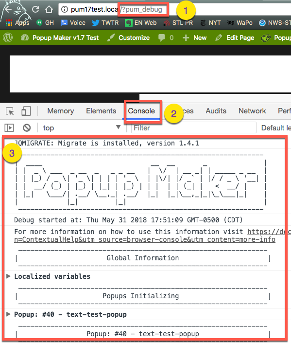 Popup Maker includes a robust set of debugging tools that can be used to evaluate plugin settings on any popup. By default, this feature is set to 'off'. Selecting this option (checkbox="checked") allows users to inspect the settings of each popup on the Console tab within any set of website inspection tools. Please raise any concerns with CRU for the team to investigate any bugging or error issues.
4) Enable Easy Modal v2 Compatibility Mode
Not required
5) Disable categories & tags?
Popup Maker is registered with WordPress as a 'popup' custom post type. Categories and tags within this post type are typically not needed by users. By default, Popup Maker removes categories and tags from popups. The option setting is set to 'on' (checkbox="checked").
6) Disable object caching
Enable this option if you have a problem saving settings, or rendering a change to a popup on your site.
7) Disable asset caching
By default, Popup Maker loads its asset files one time and then saves ( caches ) them for later use. Some servers running Popup Maker do not allow these script files to load properly. This option setting allows plugin users to turn off the plugin's caching system. If you have concerns about this, please raise a ticket with CRU
8) Disable the Popup Maker shortcode button

The popup classic editor includes a shortcode button that allows users to add a trigger, close button, or subscription form to their popup. By default, the shortcode button is enabled within the plugin. Selecting this option (checkbox="checked") removes the shortcode button from the Editor.
The shortcode button is not currently available in the popup block editor. In the block editor, add a Popup Maker shortcode to a shortcode block. Or continue to use the popup classic editor until Popup Maker fully integrates with the block editor.
9) Disable Popups Menu Editor

Popup Maker allows users to set a popup trigger on a navigation element from the WordPress Menu editor ( open 'Appearance' -> 'Menu' ). The plugin adds a drop-down menu of published popups to each menu settings box (see screenshot above).
In some situations, users may need to remove the popup trigger setting from the menu editor in order to restore other functionality within their theme. Selecting this option setting (checkbox="checked") turns off the plugin trigger setting from the menu editor. Please raise a ticket with CRU if you have any concerns
10) Complete Uninstall?
CRU handles this operation if this add-on is to be removed.
Assets category (3 option settings & 1 button)
These options are managed by CRU.
The Popup Editor -- Introduction
Overview
Popups are created in the popup editor. This article introduces users to the feature areas within the popup editor.
By default, the popup editor uses the WordPress classic editor.
The Popup Editor -- Classic Editor View
Fields

Table 1. Summary of Available Fields in the Popup Classic Editor
| File Item | Field Name | Required Field | Description |
| 1 | Popup Name (slug-name) | Yes | The popup name and slug as shown on the 'All popups' admin page |
| 2 | Popup Title | No | A title shown at the top of the popup container |
| 3 | Content | No | The popup content. Acceptable content includes text, links, shortcodes, and media image, graphics, video, audio, document files). Code scripts (PHP JS) entered directly into the editor are disabled by WordPress |
Boxes
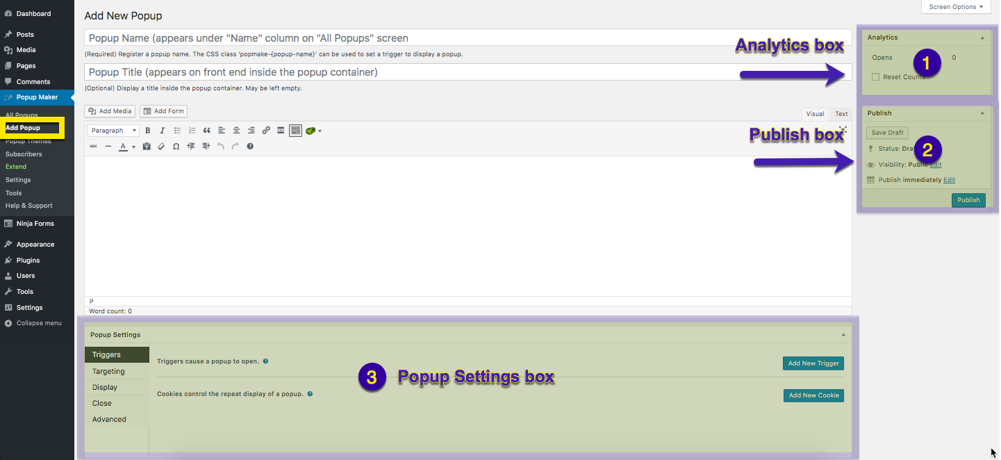
Table 2. Summary of Available Boxes in the Popup Classic Editor
| Box Item | Box Name | Required Box | Description |
| 1 | Analytics | No | View data on the number of popup 'opens' and user action, such as opening a link, or form submit ('conversions'). The analytics data counter can also be reset back to zero. The Popup Analytics add-on provides detailed analytics information about your popups, including number of times opened, average time open, conversions, average conversion time, conversion rate and more. |
| 2 | Publish | Yes | Displays the publication status of a popup; 'published', 'pending review' or 'draft'. Select the 'Publish' button to save a new popup. Select the 'update' button to save a popup revision. |
| 3 | Popup Settings | Yes (trigger only) | The primary option settings box for each popup. From the triggers tab, a popup trigger must be selected from this box to display a popup. Users can accept all other initial settings in this box to publish a working popup. |
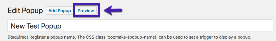
Preview Button
Once a new popup is published, a Preview button becomes available in the classic editor. Click the button to preview a popup on the front end.
Popups set with a Time Delay / Auto Open trigger will display on every page and post of a site until the Targeting option in the editor Popup Settings box is changed. If you create a popup on a live server, publish a popup with a Click Open trigger to preview it.
An alternate way to preview a published popup is to use the Popup Maker Admin Toolbar.
The Popup Maker Shortcode Button

Figure 1 (above). Popup Maker shortcode button and menu in the classic editor.
The classic editor menu includes a Popup Maker shortcode button. This feature is not currently available in the block editor menu shown below.
'Triggers' option settings

The Popup Settings -- Triggers option allows users to set a trigger and a cookie on a popup.
This section describes the 'Triggers' option in the popup editor.
Definition of Terms
Triggers -- These are events that cause a popup to display in the browser. A popup requires at least one trigger in order to display, and may accept multiple triggers.
Cookies -- These control the repeated display of popups. To work, they must be set and linked to a popup trigger. The use of cookies is optional, but often recommended.

By default, cookies are valid for a term of 1 month, which can be changed to a different term by plugin users. Popups controlled by a cookie can redisplay before they expire if the popup cookie is cleared from the browser.
Add a New Trigger
When the button labelled 'Add New Trigger' is selected, a popup labelled 'Choose what type of trigger to add?' will appear. The Popup Editor will be covered by a dark 'overlay' layer which prevents access to the background until the new trigger is added, or the popup is closed. Plugin users have the option to close the popup without setting a trigger by selecting the 'close' button ('X') in the upper right corner.

When selecting a trigger, plugin users receive a prompt to set a cookie and link it to the trigger. Refer to the checkbox below the trigger menu labelled 'Would you like to set up a cookie as well?'.
By default, no cookie is set when adding a trigger. If a cookie is not set when adding a new trigger, the trigger can be edited later to create and link the cookie.
Default Triggers
The basic version includes 3 default triggers:
| Trigger | Description |
| Click Open (default) | Displays a popup when a visitor clicks a link or. aspecific element on a web page |
| Time Delay/Auto Open | Displays a popup after a preset length of time |
| Form Submission | Processes a form places inside a popup. |
Each of the 3 triggers may be set on the same popup.
Advanced Add-On Triggers
The following, advanced add-ons add triggers to Popup Settings - please review our add-ons to see pricing and which may suit your needs:
- Exit Intent; adds the following triggers:
- Exit Intent;
- Mouse Leave,
- Lost Browser Focus;
- Back Button;
- Link Click;
- Time Delay (mobile fallback); and
- Mobile Scroll.
- Scroll Triggered Popups; adds 'Scroll Trigger';
- Age Verification; adds 'Age Verification' and 'Failed Age Redirect';
- Terms & Conditions Popups; adds 'Force Terms Agreement' and 'Click Blocking';
- AJAX Login Modals; adds 'Click Blocking' and 'Force Login'; and
- Secure User Idle Logout: adds 'Idle Time'.
Advanced triggers can be used in any combination with default basic triggers.
'Click Open' Trigger Settings
When a 'Click Open' trigger is selected, a 'Click Trigger Settings' dialogue box appears with a 'General' and 'Advanced' option settings tab.
We recommend not changing these settings and raising a ticket with CRU if you have any changes or updates to make to self-built popups.

'Click Trigger Settings -- General' option settings
We recommend not changing these settings and raising a ticket with CRU if you have any changes or updates to make to self-built popups.


'Click Trigger Settings -- Advanced' option settings
By default, a popup set to a link will prevent that link from opening 'on click', and display a popup instead. Popup turns the browser's 'on click' behaviour to 'off'.
An example would be a popup set to trigger on the 'Contact Us' page in a site navigation menu. When Popup Maker sets a trigger on that link, the plugin prevents the page link from opening. The popup appears in the browser instead of the link redirecting to the page.
Sometimes users do want the browser to work as intended 'on click'. An example might be to display a popup and allow a file download to occur at the same time.
In that case, need to allow the browser to process the file download. Select the checkbox labelled 'Do not prevent the default click functionality.' to turn 'on' the browser's 'on click' action.
'Time Delay' Trigger Settings
When a 'Time Delay / Auto Open' trigger is selected, a 'Time Delay Settings' dialogue box appears with a 'General' option settings tab.

'Time Delay Settings -- General' option settings
Delay -- The time delay setting in milliseconds (ms). The time delay range is set between 0 - 10,000 ms (10 seconds), with a default of 500 ms (0.5 seconds). The time range slider can be edited, and will accept any value greater than the initial default maximum. The range slider will automatically reset the time range, and display the new input value within the adjusted range.
Cookie Name -- A custom field to either 'Add a New Cookie' or link an existing cookie with an ID of "pum-{integer}".
'Form Submission' Trigger Settings
When a 'Form Submission' trigger is selected, a 'Form Submission Trigger Settings' dialogue box appears with a 'General' option settings tab.

'Form Submission Trigger Settings -- General' option settings

Form -- Set a form submission trigger on a form placed inside a popup. The trigger fires when the form submit button is clicked.
By default, the trigger is set on any form supported by Popup Maker. If no WordPress form plugin is active, the trigger will target Popup Maker’s default subscription form.

When a form plugin supported by Popup Maker is active, those plugins will also appear as menu options in the ‘Form’ field. The screenshot above shows the available menu options when the Ninja Forms plugin is active, and several forms are published.
Delay -- The time delay interval in milliseconds (ms) between when the form submit button is clicked and the trigger fires. By default, the interval is set to 0 ms, with an available range between 0 - 10,000 ms (10 seconds).
Cookie Name -- A custom field to either 'Add a New Cookie' or link an existing cookie with an ID of "pum-{integer}".
Edit an Existing Trigger

Edit an existing trigger by selecting the 'pencil' icon in the column labelled 'Actions'. A 'settings' options box will display, prompting the selection of additional options.
Delete an Existing Trigger
 Delete an existing trigger by selecting the 'X' in the column labelled 'Actions'.
'Targeting' option settings
The Popup Settings -- Targeting option allows users to accept or change the conditions when a popup will display.

How Targeting Conditions Work with Triggers
Targeting conditions prepare a popup to display by preloading them in the browser on page load (a process known as activation). A popup trigger checks the popup’s activation state. If the popup is present in the browser, the trigger proceeds to fire, and the popup displays.
User Options to Set Targeting Conditions
Each list item links to it's description block located below the horizontal line.
- Do nothing. Accept the plugin default settings.
- Target the popup to display based on content (Standard Targeting Conditions).
- Target the popup to display based on conditions other than content (Advanced Targeting Conditions).
- Target pages using WooCommerce conditions.
- Target pages using BuddyPress conditions.
1) Do nothing. Accept the default settings. By default, Popup Maker activates each popup to display on every page of your site. This ensures that the two default triggers included with the basic version ( ‘Auto Open / Time Delay’, and ‘Click Open’ ) always work to display a popup.
The choice of trigger affects whether or not a popup will display immediately. An ‘Auto Open / Time Delay’ trigger will automatically display a popup on each page when the ‘Targeting’ default option is ‘on’. By comparison, a ‘Click Open’ trigger will display a popup only if a trigger is set on a page element, and a visitor clicks on that element.
When setting up the ‘Targeting’ option tab, the simplest choice is to do nothing and accept the plugin’s default option setting. See the related article below to review the initial popup settings preset to every popup. When you know these settings and what they do, you can customise your popup to achieve the result you want.
2) Target the popup to display based on content. Standard targeting conditions target a popup to display on a page or post, or by post category or tag. Actively choose which page or post to target a popup, and limit where the popup can potentially appear on your site.
Choose from among the post and page options provided in the custom field labelled with the placeholder 'Choose a condition'. Only one condition may be selected from the drop-down menu at a time. Two or more conditions can be set together and combined using either an OR or AND operator.
3) Target the popup to display based on conditions other than content. The advanced add-on Advanced Targeting Conditions provides additional, non-content-based options to activate a popup. Please check our Add-ons for more information
Content-based and non-content-based conditions may be set together on the same popup.
4) Target pages using WooCommerce conditions. When the WooCommerce and Popup Maker are both activated, Popup Maker provides a free set of conditions to target WooCommerce:
- pages,
- conditions,
- products,
- product categories, or
- product tags.
WooCommerce Conditions
Popup Maker adds a set of WooCommerce conditions to the standard targeting conditions. Within the Popup Editor, view these newly activated conditions on the 'Targeting' option tab of the 'Popup Settings' box. Select the drop-down custom field labelled 'Choose a condition to get started'.
The following WooCommerce targeting conditions are included as options:
- WooCommerce (specific pages or endpoints provided by the plugin);
- Products;
- Product Categories;
- Product Tags; and
- Product Shipping Classes.
WooCommerce

All WooCommerce
- This Condition loads the popup on all WooCommerce Pages.
Shop Page
- Loads the popup on only the Shop Page.
Cart Page
- Loads the popup on only the Cart Page.
Checkout Page
- Loads the popup on only the Checkout Page.
Account Page
- Loads the popup on only the Account Page.
Is Endpoint Conditions - When a user hits a certain stage within a WooCommerce site, WC refers to that as an endpoint. The following Popup Conditions will load popups only on these endpoints within WooCommerce.
- order-pay
- order-received
- view-order
- edit-account
- edit-address
- lost-password
- customer-logout
- add-payment-method
Products

Products Archive
- This Condition will load the popup on the Products Archive Page only.
All Products
- Loads the popup on only the Products Pages.
Products: Selected
- Loads the popup on only the Product Pages you select. Select Product Page(s) by typing and clicking what is available.
Products: ID
- This works the same as Products: Selected, but uses Product IDs instead.
Products: With Tag
- Loads the popup on only Product Pages that have been Tagged with the Tag(s) that you choose here.
Products: With Product Category
- Loads the popup on only Product Pages that have the Category(s) that you choose here.
Products: With Product Tag
- Loads the popup on only Product Pages that have the Tag(s) that you choose here.
Products: With Shipping Class
- Loads the popup on only Product Pages that have the Shipping Class(s) that you choose here.
Product Categories

Product Categories: All
- Loads the popup on all Product Pages that have a Category. Uncategorised Products will not load a popup.
Product Categories: Selected
- Loads the popup on only Product Pages that have the Category(s) that you choose here.
Product Categories: IDs
- This is the same as Categories: Selected, but uses IDs instead.
Product Tags

Product Tags: All
- Loads the popup on all Product Pages that have a Tag. Untagged Products will not load a popup.
Product Tags: Selected
- Loads the popup on only Product Pages that have the Tag(s) that you select here.
Product Tags: IDs
- This is the same as Tags: Selected, but uses IDs instead.
Product Shipping Classes

Product Shipping Classes: All
- Loads the popup on all Product Pages that have a Shipping Class. Products without a Shipping Class will not load a popup.
Product Shipping Classes: Selected
- Loads the popup on only Product Pages that have the Shipping Class(s) that you select here.
Product Shipping Classes: IDs
- This is the same as Shipping Classes: Selected, but uses IDs instead.
'Display' options settings
Overview

The Display option within the Editor's Popup Settings box contains 5 option categories. They include, from left to right:
- Appearance
- Size
- Animation
- Position
- Advanced
This article briefly describes each of the properties assigned within each option category.
Category: Appearance
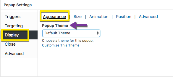
Choose a Popup Theme for this popup. Options include the 6 themes preinstalled on plugin activation and any additional saved custom themes.
Property Description
Popup Theme -- The preset style of the popup container and background surrounding the container. Default: 'Default Theme'.
The default popup theme for each new popup is set on the Settings >> General admin page.
Category: Size

Select the size of the popup. The plugin includes 8 sizes that responsively adjust inside the screen window. Custom, non-responsive sizing can also be selected.
Property Descriptions
Size -- The size of the popup relative to the surrounding screen window. Responsive sized popups provide equivalent padding between the right and left sides of the popup container and the browser window. See 'Auto' size below for comparison.
Options: Responsive Sizes (8):
- Nano - 10%;
- Micro - 20%;
- Tiny - 30%;
- Small - 40%;
- Medium - 60% (plugin default);
- Normal - 70%;
- Large - 80%;
- X-Large - 95%.
Options: Non-responsive Sizes (2):
- Auto -- The popup container automatically fills the width of the browser window. No padding is provided between the popup container and the window.
- Custom -- The popup width and height are set, and do not resize as the screen size becomes smaller. Select this option if you intend to display a popup only on a desktop screen.
- Default: 640 px wide x 380 px high. Optional Units: %, em, rem.
Min Width -- The minimum width set for the popup. This property is only available for popups set to resize responsively. Default: 0%. Optional Units: px (pixels), em, rem.
Max Width -- The maximum width set for the popup. This property is only available for popups set to resize responsively. Default: 100%. Optional Units: px (pixels), em, rem.
Auto Adjust Height (checkbox) -- Available when Size: Custom selected. This setting changes the height of the popup container to display all of the popup's contents. If the auto adjusted height is likely to exceed the height of the screen, use the 'Scrollable Content' property instead to allow visitors to vertically scroll the content inside the popup. Default: unchecked (off).
Scrollable Content (checkbox) -- Available when Size: Custom selected. Allows for vertical scrolling of content inside a popup. Use this property when the length of the content exceeds the normal height of a popup. Default: unchecked (off).
Category: Animation

Select the type and speed of animation to display when a popup closes.
Property Descriptions
Animation Type -- The type of animation effect displayed when a popup closes.
Default: Fade. Options: None, Slide, Fade & Slide.
Animation Speed -- The speed at which a popup closes.
Default: 350 ms (milliseconds) or 0.350 seconds
Range: 0 - 1000 ms ( 0 - 1 second )
Category: Position

Select the point to anchor the popup container inside the browser window. Options are available to position a popup relative a Click Open trigger, and set a popup to a fixed position.
Property Descriptions
Location -- The point inside the browser window to anchor the popup container.
Default: Top Center.
- Options ( 9 ):
- Top Left;
- Top Center;
- Top Right;
- Middle Left;
- Middle Center;
- Middle Right;
- Bottom Left;
- Bottom Center; and
- Bottom Right
Top (range finder) -- The distance (measured in pixels) between the top of the popup container and the top of the browser window. The property is active when Location is set to either Top Left, Top Center, or Top Right. Default: 100 px. Range: 0 - 500 px.
Left (range finder) -- The distance between the left side of the popup container and the left side of the browser window. The property is active when Location is set to either Top Left, Middle Left, or Bottom Left. Default: 0 px. Range: 0 - 500 px.
Right (range finder) -- The distance between the right side of the popup container and the right side of the browser window. The property is active when Location is set to either Top Right, Middle Right, or Bottom Right. Default: 0 px. Range: 0 - 500 px.
Bottom (range finder) -- The distance (measured in pixels) between the bottom of the popup container and the bottom of the browser window. The property is active when Location is set to either Bottom Left, Bottom Center, or Bottom Right. Default: 0 px. Range: 0 - 500 px.
Position From Trigger (checkbox) -- This setting changes the reference frame for a popup from the browser window to a link set with a Click Open trigger. When this feature is active, a popup is anchored as close as possible to the Click trigger, rather than framed relative to the browser window. Default: unchecked (off).
Fixed Positioning (checkbox) -- Use this setting in combination with the Disable Overlay checkbox ( Popup Settings >> Display >> Advanced >> Disable Overlay). When this feature is active, a popup is fixed in position while the screen content can scroll behind the popup. Default: unchecked (off).
Category: Advanced

A collection of specialty settings for managing a popup display. The settings:
- remove the overlay layer from view;
- allow for 2 or more popups to display at the same time;
- disable popup resizing when the window size changes; and
- assign a popup z-index value relative to the browser’s content.
Property Descriptions
Disable Overlay (checkbox) -- Removed the overlay layer from view. See the following related article for an explanation of the overlay layer. Default: unchecked (off).
Stackable (checkbox) -- By default, Popup Maker is designed to display only one popup on the screen at a time. When selected, this feature allows two or more popups to display together. Default: unchecked (off).
Disable Repositioning (checkbox) -- By default, Popup Maker automatically readjusts the position of a popup container inside the browser window as the screen size changes. When selected, popup repositioning is disabled. Default: unchecked (off).
Popup Z-Index (integer) -- The 'z-index' value determines the placement of vertical layers inside a browser window. Layers with higher z-index values are placed closer to the front of the screen.
By default, the popup container is assigned a high value to ensure it appears in front of all other content inside the browser window. There is usually no reason to change this value. Default: 1999999999.
'Close' option settings
Overview

The Close option within the Editor's Popup Settings box contains 3 option categories.
- Button
- Form Submission
- Alternative Methods
Category: Button

Override a popup's close button text, and delay the appearance of the popup close button.
Note: Popup 'Close Settings' should be set and styled in the 'Popup Themes' Editor. The popup theme should then be applied via the 'Display -- Appearance' option settings of the Popup Settings box.
Property Description
Close Text -- Override the value set by the assigned popup theme's Close Button Text.
For example, a value of 'CLOSE' set at Popup Maker >> Popup Themes >> Close >> Close Button Text could be changed to 'X' for a single popup. To maintain a consistent style across all popups, use the Close Button Text set in the Popup Theme Settings box.
Default: Value set by the Popup Theme at Popup Settings >> Display >> Appearance.
To entirely remove the Close button from a popup so that visitors must interact with the contents of a popup, use the advanced popup feature for Forced Interactions
Close Button Delay -- Delay the appearance of the close button when a popup opens. This may increase visitor engagement with the popup's contents ( reading, clicking a link, or submitting a form ).
Default: 0 ms (milliseconds); close button appears at the same time as the popup.
Delay range: 0 - 3000 ms (0 - 3 seconds).
Category: Form Submission

Property Description
Close on Form Submission (checkbox) -- Automatically close a popup after a form placed inside it is submitted. This feature is available when using the Popup Maker Subscription Form or a WordPress form plugin that is supported by Popup Maker.
Closing a popup form after a user clicks the 'Submit' button implies their action caused an effect. Many form plugins also allow one to display a confirmation message after a form is submitted and disappears from view.
Default: unchecked (off); the popup form will remain visible after a form is submitted.
Category: Alternate Methods

By default, a popup is closed by selecting the Close button displayed in the popup container. Several alternative methods allow visitors to close a popup by clicking on the popup overlay layer, or using their keyboard. By default, each of the following methods is not enabled (turned 'off').
Property Description
Click Overlay to Close (checkbox) -- Allow visitors to close a popup when the popup overlay layer is clicked or touched. The overlay layer is the area outside the popup container.
Activating this feature provides visitors a larger area to close a popup. The expanded close feature will even work when the overlay layer is disabled.
Default: unchecked (off).
Press ESC to Close (checkbox) -- Allow visitors to close a popup by using their keyboard Escape (ESC) key.
Default: unchecked (off).
Press F4 to Close (checkbox) -- Allows visitors to close a popup by pressing their keyboard.
In the Windows operating system, the keyboard F4 function key allows users to close application windows and programs. When enabled, this feature extends that capability to all plugin users, regardless of their operating system.
Default: unchecked (off).


Related Articles
Pop Ups (Basics) - Troubleshoot Guide
Updating Text in Website Popup Messages Follow the steps below to edit the text on the popup message. Navigate through Pop Maker → All Popups Edit the popup title here (this is optional as this is not used commonly) Edit the content of the popup ...Pop Ups (Basics)
View Guide Links at the bottom of the page Installation 1 CRU CREDIT Setup (optional) 2 CRU CREDIT Ease Of Use Easy Want this feature? Request Here Purchase CREDITS Here DRIVE MORE SALES AND EMAIL LIST OPT-INS USING POPUPS Create conversion-focused ...Popup Maker - User Guide
For pricing and how to add to your website see at the bottom of the page. Create Your First Popup Open the Popup Editor From the WordPress admin, either: 1) Open Popup Maker >> All Popups, and select the Add New Popup button at the top of the admin ...Popup Maker - Troubleshooting Guide
Can't see any Troubleshooting Guides on this page? This means we don't have any, please raise a ticket here if you have an issue and help us build out our guides! Overview and pricing of this feature. Click here Looking for the user guide for this ...Basic Wordpress - User Guide
Permalinks Overview Permalink is short for “permanent link.” Permalinks are permanent URL structures used to help organise the content of your website (pages, posts, products, etc.) so it can be efficiently navigated, shared, and referenced by users ...